Sunday, February 9, 2020

Fusible Webbing (Round 1)


 "Nesting" was created for the AtlasQuest LTC tracker "Round 1: New Product/Underused"  hosted by Linden Leaf. I chose to work with Fusible Webbing (FW) for the four rounds of the tracker. For each round, I need to find a new way to use FW.


For the first round, even though I chose a technique that I've used before, this card would offer its own challenges.

The following technique is easy and, in my opinion, creates a dramatic effect.

FusibleWebbing is available at JoAnn Fabric & Craft Store and other crafting outlets. (Zoom in to read the label.) When heat is applied, the FW fuses with fabric, lace, ribbon, paper, cardboard, wood and more. Since I haven't used this since 2014, I can say that the product doesn't go bad.

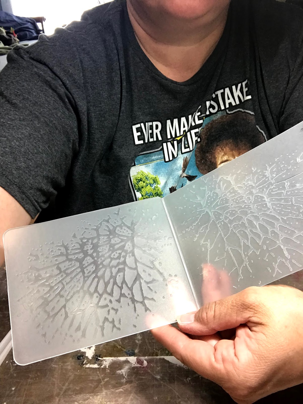
I also learned about a fusible powder that can be sprinkled over the materials: Bo-Nash Bonding Agent


For the first round of the LTC tracker, I created a nesting mix by cutting up leftover pieces of ribbon, yarn, string, fake leaves...anything I could find!


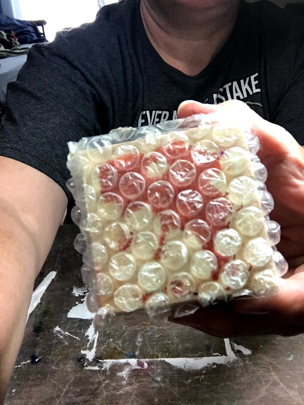
The FW has a disposable paper backing that is removed. I cut small squares and added them to the nesting mix so they would fuse all the nesting bits together on the card.


After peeling the backing, I applied a strip of cut FW to the card, sticky side down. In hindsight, I think having the sticky side facing out would have helped control the nesting material more so.

After placing parchment paper under the card, I clustered the nesting material onto the card over the FW. I wasn't worried about overhang because I would trim that off later.


Then I sandwiched the card between parchment. Meanwhile, I've been heating up my craft iron on the cotton setting (steam is recommended but it works without it too,) 


I pressed the card (making sure to protect my work surface too.) The heat melts the FW creating a sticky bond within the nesting and between the nesting and the card.

It is a good idea to let the card cool before pulling the parchment off so the FW sets (and avoid burning your fingers on hot melted plastic.) I added additional bits of FW where needed to secure the nesting or added more nesting and then reapplied heat.


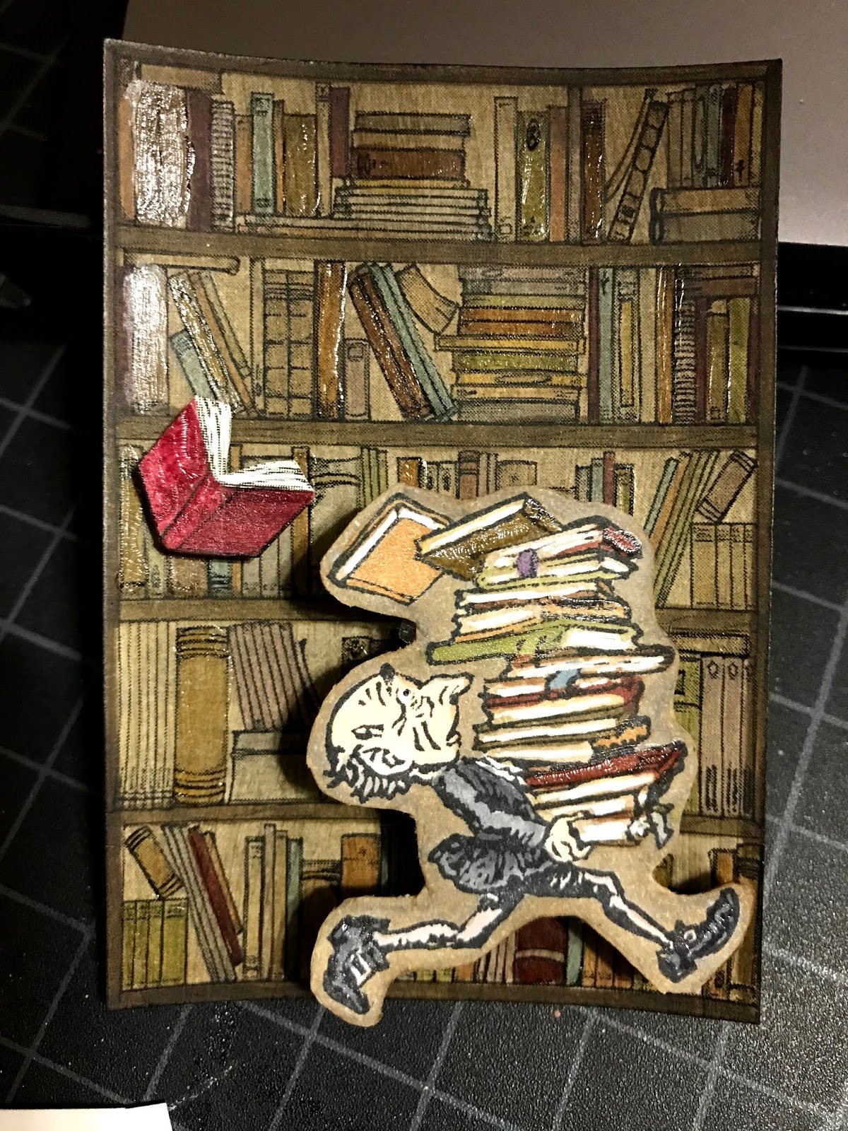
The stamped image was simply colored in Copic marker and after fussy cutting it, adhered to the card with an adhesive foam square. I embossed the background with the Richard Garay pine needle folder and a Big Shot machine. I couldn't decide between the bird perching on the nest or nestled within. Happy with both. 


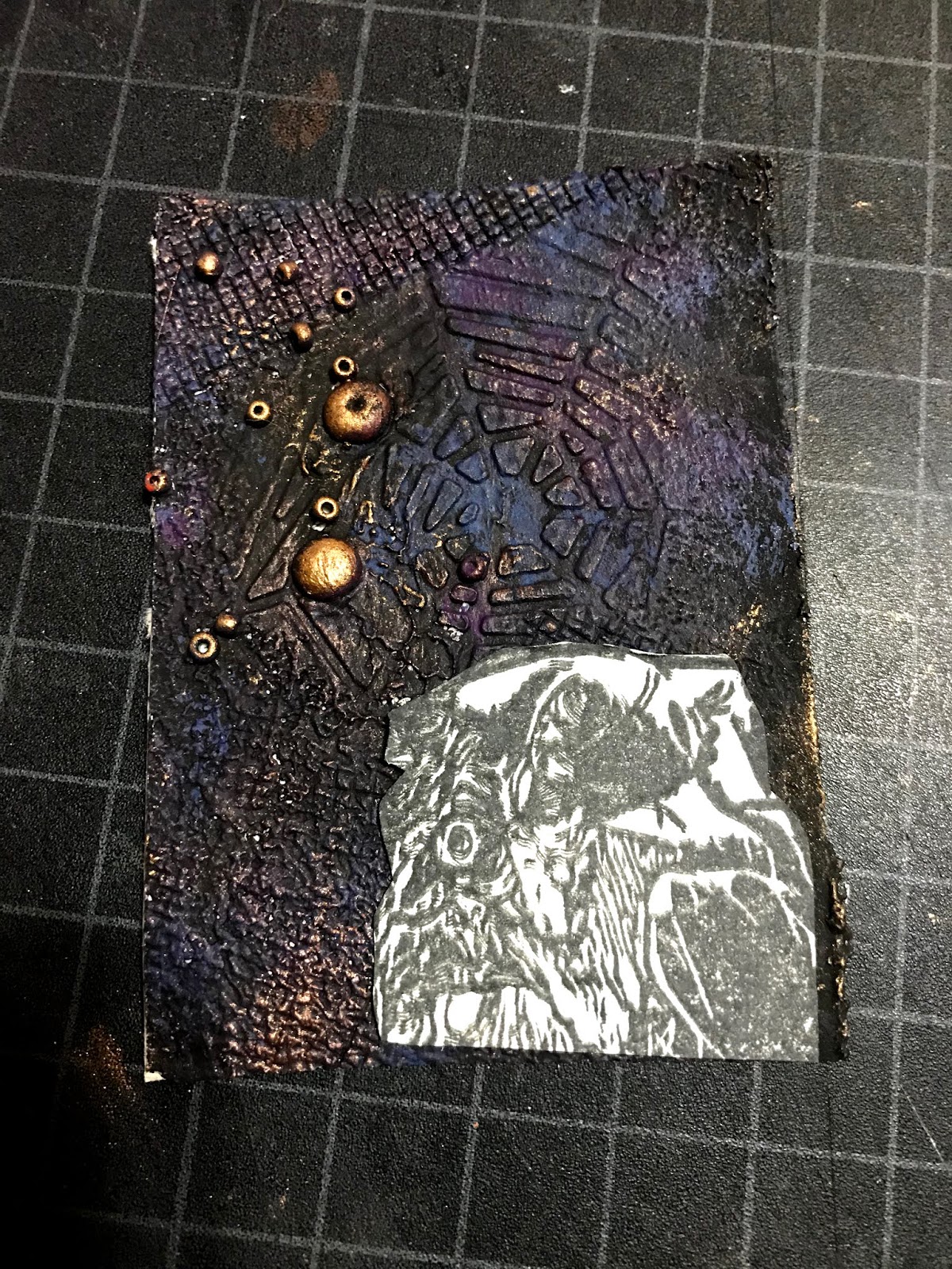
Below are two more cards using the same technique:


April Fool's Leftover Quickie Swap:
Juggler of the Cosmos, March 2014.


Fiber Art:
Serenity at Sunset, June 2014


Monday, October 28, 2019

Balancing Act

   
For the Earth Tones tracker by jlsd0218, I wanted something other than the obvious earthy images, and so I brainstormed ideas with my sister Poo Slingers. She mentioned library books, and that idea led to finding this lil fellow. I immediately fell in love with him and began visualizing a card. I was not able to find the original artist to give credit for this image.
    I wanted the background to look like shelves filled with old book in a library. I searched and found the image below. I copied and pasted it to a word document then cropped the section(s) I wanted, modified the color (sharpness, saturation, contrast, etc.) and adjusted the size (2.5x3.5.)     


Next, I printed a copy of the bookshelves to assess the layout with the already-carved image of the lil man. 

With some LTCs I make, I will layer the images on my computer screen to determine the exact size of the image(s) to be carved and/or printed.


Once all adjustments to the image have been made, I copied and pasted multiples and then printed on white cardstock.


With a good movie to entertain me, I got busy coloring the shelves of books with earth tone Copic markers. Two movies later...

FYI:
The Sum of All Fears  &
Battle Los Angeles 


The colors seemed too cheerful, too crisp. I wanted the aged look, so I applied a transparent acrylic gel paint with a sepia tone. I applied two coats, wanting to mute the background so the main image would pop more while maintaining all those earth tones.

A sepia gel, or any transparent gel application, can be made from basic gel paint and adding acrylic paint until you get the color you want.


I had recently watched and shared on LTC Fanatics a fantastic video about the powerful effects of clear varnish to painted artworks-- Is Clear a Color? and so decided to use some clear crackle gel (that I wanted to get rid of) to give my lil shelves more dimension. With a small brush, I highlighted many of the books. I loved the effects. 


Next, I colored the man with earth tone Copic markers. I could not fathom fussy cutting this image and so left a little background which I usually see shaded in gray. The overall image was not sitting right with me.


With the help of some thinking from LTC-making friends, I decided to shade his background a color that matched the background shelves. I also applied the clear gel to some of his books and highlighted the books' pages and his eye with white gel pen, which then required adding a black dot for his eye. And as always, coloring/distressing the edge of the cut out image with marker. 


I had already decided that I would lift the man from the background with adhesive foam, but then an a-ha moment occurred.  Here is this lil man running the aisles of an old library with this taller-than-himself stack of books that are quickly unbalancing. And the look on his face... well, this demanded an Action Wobble Spring!

Wobble Springs are plastic springs with two adhesive surfaces. I had to cut the adhesive surfaces down to accommodate for the man's size. Video shows the lil man balancing his books.


Even with the color changes, the wobble spring and the clear highlights, there was something about the card that still wasn't sitting right with me. Then the inspiration I needed came, "rule of three." I first heard about this from my scrapbooking friend Melba P. (aka Transistor Sister.) In search of a link for you, I happened upon an interesting read at Create and Craft Blog and learned that there are three rules to the rule of three. 


It was easy to decide what to add to the card-- a book flying off the stack! I chose two images to work with. Again using my computer to adjust size and to print multiple copies (no pun intended.)


I made quick work of coloring and highlighting the book with clear  and white gel. I used my Copic blending marker to pull some color off two sides of the book so as to create some shadow and texture.


The finished card is titled "Balancing Act." I like that the title isn't just about the man trying to balance the books. Balance also applies to the colors, the layout, the number of elements, the time invested into each element, and most of all my satisfaction with the final product.

Thanks for reading and following!


Monday, October 7, 2019

#INKTOBER October 2019

Oct 1, ring

Oct 2, mindless (as in automatic)

Oct 3, bait 

Oct 4, freeze


Oct 5, build


 Oct 6, husky

Oct 7, enchanted

Oct 8, frail

Oct 9, swing


Oct 10, pattern
Oct 11, snow
Oct 12, dragon
Oct 13, ash
Oct 14, overgrown
Oct 15, legend
Oct 16, wild
Oct 17, ornament
Oct 18, misfit
Oct 19, sling
Oct 20, tread
Oct 21, treasure
Oct 22, ghost
Oct 23, ancient
Oct 24, dizzy
Oct 25, tasty
Oct 26, dark
Oct 27, coat
Oct 28, ride
Oct 29, injured
Oct 30, catch
Oct 31, ripe


Multi-Dimensional Background with Molding Paste

Final Product.


Resources needed:
  • card stock or other porous surface to work on
  • molding paste
  • textures: no need to buy anything. Use lids, crinkled paper or plastic, cut zig zags or curves into cardboard edges, bubble wrap, etc.
  • tool to apply paste-- plastic knife/spoon, popsicle stick, putting knife
  • acrylic paint assortment
  • brushes, stencil brushes, sponges, etc.
  • optional: small do dads: beads, pieces of ribbon, wire, chip cardboard pices, cardstock cutouts, puzzle pieces, scraps of pink, 


 Textures wrapped and secured around wood blocks. Something new I'm trying.


Embossing folders create dimensions/textures as well. Also going to press small beads into the molding paste.


Liquitex molding paste. Matte finish.


Secure the card stock to the work surface or use a non-slip surface. Kraftex (paper fabric) works well too. Any surface that is porous.

Glopping the paste on the card stock. I use a pice of card stock that when cut would make 3 or 4 trading cards. Size will affect available working time while paste is drying.

Once applied, the surface doesn't have to be smooth but needs to be relatively evenly applied so I used a ruler. Overall about 1/16 to 1/8 inch works well for impression depth. 

IMPORTANT: Before stamping, the paste needs to set-up for a few minutes. If touched, the paste should not stick to your finger-- too wet. A craft heat gun can expedite the set-up process. If it is too dry, the paste will not take the impressions. 


The impression on the left is perfect. The right side was still too wet 
and the paste stuck to the folder, but still makes a cool effect.
 

I love the screen texture.

Embossing folder impressions. Definitely want to toss used folders in a tub of water. Once the paste dries on the folder, it is more challenging to clean it from the folder crevices.


I used the flat side of the embossing folder to press beads into the paste. 
If they do not stick, spritz the surface lightly with water to moisten the paste and press again.


Find a safe place (away from kitty cats) for the paste to dry.


Once dry, apply acrylic paints with brushes or sponges. I used a metallic paste to make the beads and other raised dimensions pop. Multiple layers can be applied until the effect is achieved. Let each layer dry before added the next unless blending is wanting.

Easier to measure & cut from the back side. 

Determine which direction for best layout, and add additional color where needed on each card.

Lots of coloring and fussy cutting ahead to prepare the main image (witch.)

Distress the edges of both the witch cutout and the card with black ink, and adhered the witch with an adhesive foam square. A white edge of an unfinished piece poking its head out takes away from the overall appeal.