I wanted the background to look like shelves filled with old book in a library. I searched and found the image below. I copied and pasted it to a word document then cropped the section(s) I wanted, modified the color (sharpness, saturation, contrast, etc.) and adjusted the size (2.5x3.5.)

 Next, I printed a copy of the bookshelves to assess the layout with the already-carved image of the lil man.
 With some LTCs I make, I will layer the images on my computer screen to determine the exact size of the image(s) to be carved and/or printed.

Once all adjustments to the image have been made, I copied and pasted multiples and then printed on white cardstock.

With a good movie to entertain me, I got busy coloring the shelves of books with earth tone Copic markers. Two movies later...
FYI:
The Sum of All Fears &
Battle Los Angeles

The colors seemed too cheerful, too crisp. I wanted the aged look, so I applied a transparent acrylic gel paint with a sepia tone. I applied two coats, wanting to mute the background so the main image would pop more while maintaining all those earth tones.
A sepia gel, or any transparent gel application, can be made from basic gel paint and adding acrylic paint until you get the color you want.
I had recently watched and shared on LTC Fanatics a fantastic video about the powerful effects of clear varnish to painted artworks-- Is Clear a Color? and so decided to use some clear crackle gel (that I wanted to get rid of) to give my lil shelves more dimension. With a small brush, I highlighted many of the books. I loved the effects.


Next, I colored the man with earth tone Copic markers. I could not fathom fussy cutting this image and so left a little background which I usually see shaded in gray. The overall image was not sitting right with me.

With the help of some thinking from LTC-making friends, I decided to shade his background a color that matched the background shelves. I also applied the clear gel to some of his books and highlighted the books' pages and his eye with white gel pen, which then required adding a black dot for his eye. And as always, coloring/distressing the edge of the cut out image with marker.

I had already decided that I would lift the man from the background with adhesive foam, but then an a-ha moment occurred. Here is this lil man running the aisles of an old library with this taller-than-himself stack of books that are quickly unbalancing. And the look on his face... well, this demanded an Action Wobble Spring!
Wobble Springs are plastic springs with two adhesive surfaces. I had to cut the adhesive surfaces down to accommodate for the man's size. Video shows the lil man balancing his books.
Even with the color changes, the wobble spring and the clear highlights, there was something about the card that still wasn't sitting right with me. Then the inspiration I needed came, "rule of three." I first heard about this from my scrapbooking friend Melba P. (aka Transistor Sister.) In search of a link for you, I happened upon an interesting read at Create and Craft Blog and learned that there are three rules to the rule of three.

It was easy to decide what to add to the card-- a book flying off the stack! I chose two images to work with. Again using my computer to adjust size and to print multiple copies (no pun intended.)
I made quick work of coloring and highlighting the book with clear and white gel. I used my Copic blending marker to pull some color off two sides of the book so as to create some shadow and texture.
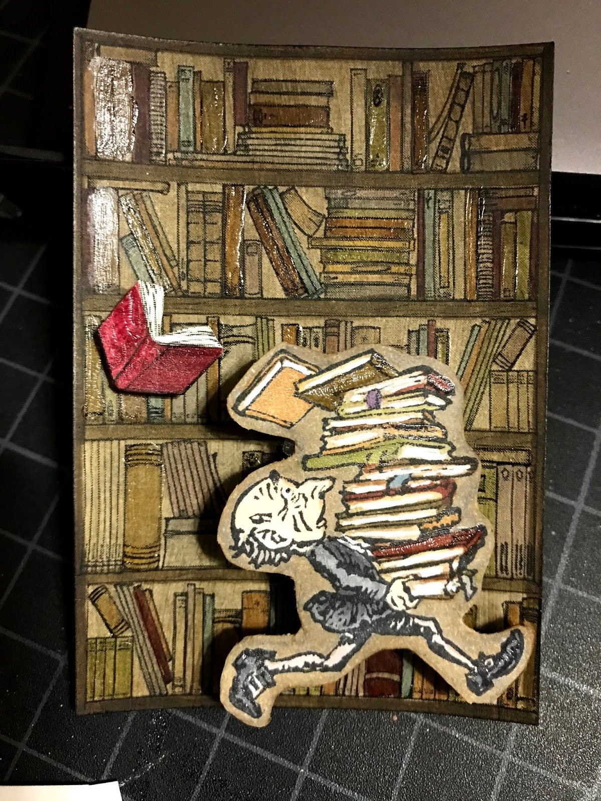
The finished card is titled "Balancing Act." I like that the title isn't just about the man trying to balance the books. Balance also applies to the colors, the layout, the number of elements, the time invested into each element, and most of all my satisfaction with the final product.
Thanks for reading and following!