
 I decided to try splattering paint so the first steps would involve choosing the right cardstock and paint or alcohol ink. After playing with acrylic paint and Canson 140 paper, I explored alcohol ink with glossy cardstock (which was actually photo paper.)
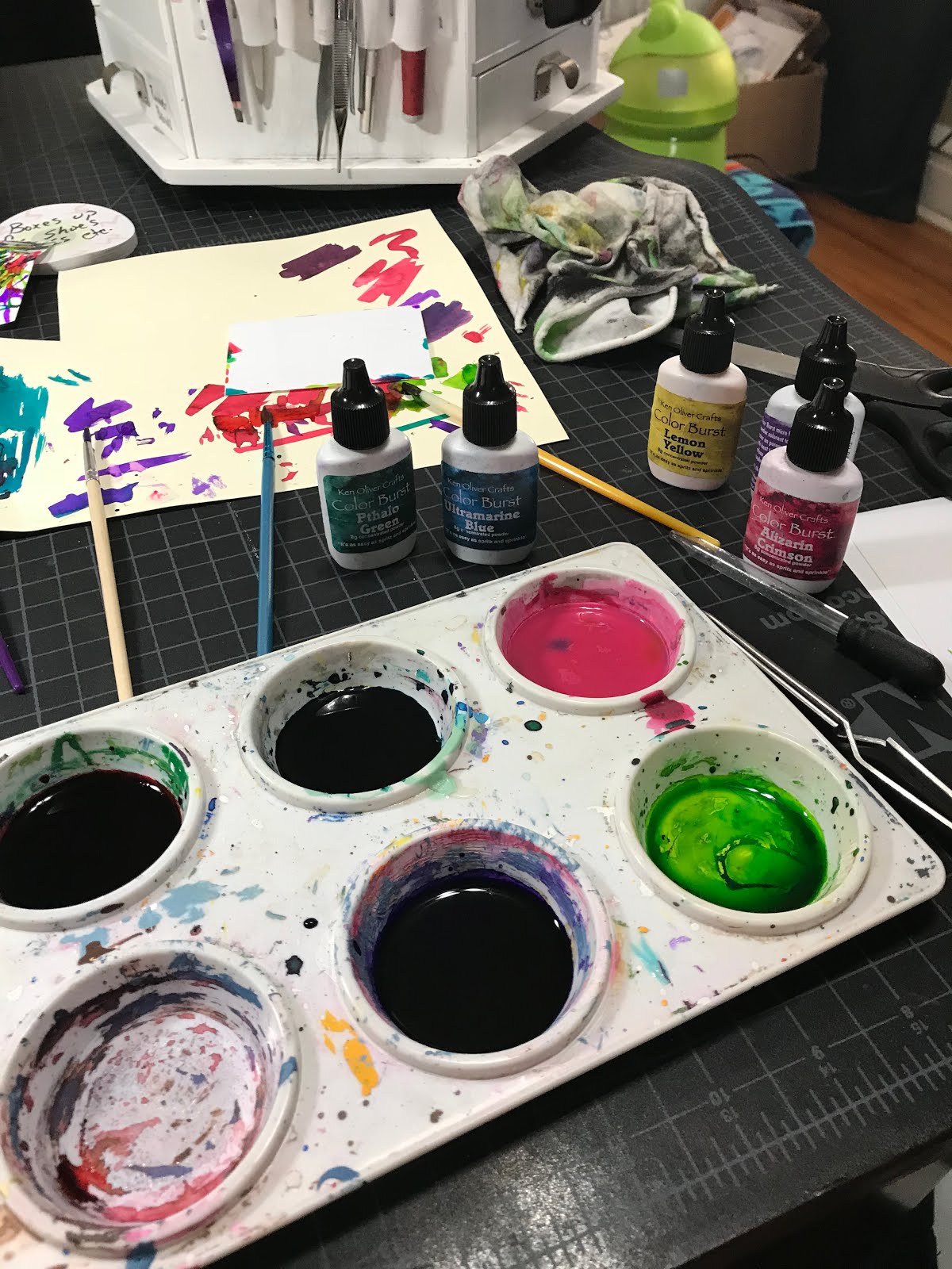
Then, I tested Color Burst-- a concentrated watercolor powder (see pict.) With each test, I also had to determine whether the liquid color would move on the card to create the splatter effect and whether the medium would dry and not smear. I was pleasantly surprised that the Color Burst liquid (water + powder) dried and adhered without problems. Plus, I loved the brilliant color.

During first attempts, I strategically placed a drop of the watercolor on the card. I blew through a straw directly downward at the drop.
It was easier to work through half a straw.
ter a few trial and errors, I began mass producing cards. It was easier to work through half a straw.

The direction of the starburst could be controlled by angling the straw.

I was happy with the results. With the exception of that splotch in the middle of each starburst. Many of those faded when drying.


I added another step to the process as I wanted more random splotches. Using my recycling bin, I arranged cards and then whipped a paint brush, wet with the Color Burst, across the cards.

I have no idea why I changed my splattering method, but instead of placing a drop of paint on the card with a brush, I blew directly onto the brush. The intensity of the air burst as the distance the brush is from the paper affected each outcome. In a sense I was now air-brushing. Notice the cool apron which is a good idea when splattering paint.

The top two purple splatters were done by blowing directly onto the brush as seen in the picture to the left. The DROP is the first method I used.
Final backgrounds. I like how each card has its own personality.

Now to add the stamped image.

 Surprisingly, Versafine pigment ink dried on the prepped photo paper and without smearing. I pre-tested both StazOn and Versafine on messed up splattered cards.
I marked my oddly shaped carved stamp so I could easily line it up on the cards (left.)
Next, I stamped a plastic LTC sleeve with StazOn to help me determine stamp placement on each card. (StazOn adheres and dries on the sleeve.)
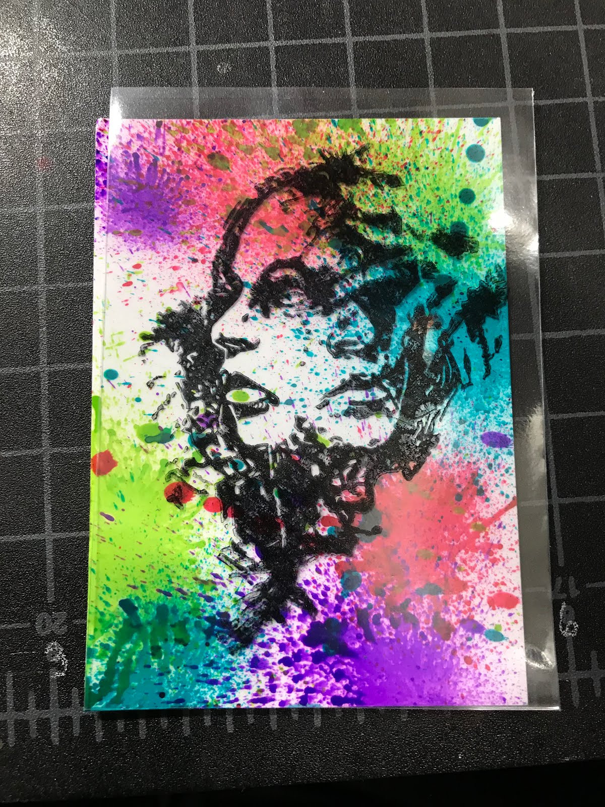 The LTC sleeve was placed over the card to determine the best direction of the background.
I'll either frame the card with another card stock layer or distress the edges to finish this piece up. I'm enjoying the outcome.
Thanks Jeremy Scott for the inspiration and beautiful artwork!