Sunday, December 4, 2022

A Good Impression

The key difference between Letterbox Trading Cards (LTC) and Artist Trading Cards (ATC) is the stamped impression of a hand-carved stamp.

It can be frustrating stamping multiple cards and not getting a clear, solid stamped impression, and as frustrating to receive cards in a swap with unclear stamped impressions.


There are many ways to achieve a good impression:

1. CHOICE OF INK: pigment inks, such as Versafine, tend to provide a bold, solid impression. But pigment ink isn't aways the best option when using other media on the same area. For example, when using Copic markers with  a pigment impression, the ink will smear.  Types of stamping ink.

2. SURFACE TO STAMP ON: some papers/card stock have a texture and therefore the stamp cannot make contact with the entire surface, or the surface will not absorb the ink, such as glossy card stock. 

3. USING A JUICY INKPAD: Most stamp pad brands offer re-inkers. Keep stamp pads juicy for bolder impressions.

4. USING A STAMPING PLATFORM: One of my favorite methods for achieving a solid stamped impression is using a stamping platform:  Top 5 Stamping Platforms. A stamping platform (or jig) allows you to align and stamp multiple impressions one on top of the other.


Here are few strategies I use to pursue
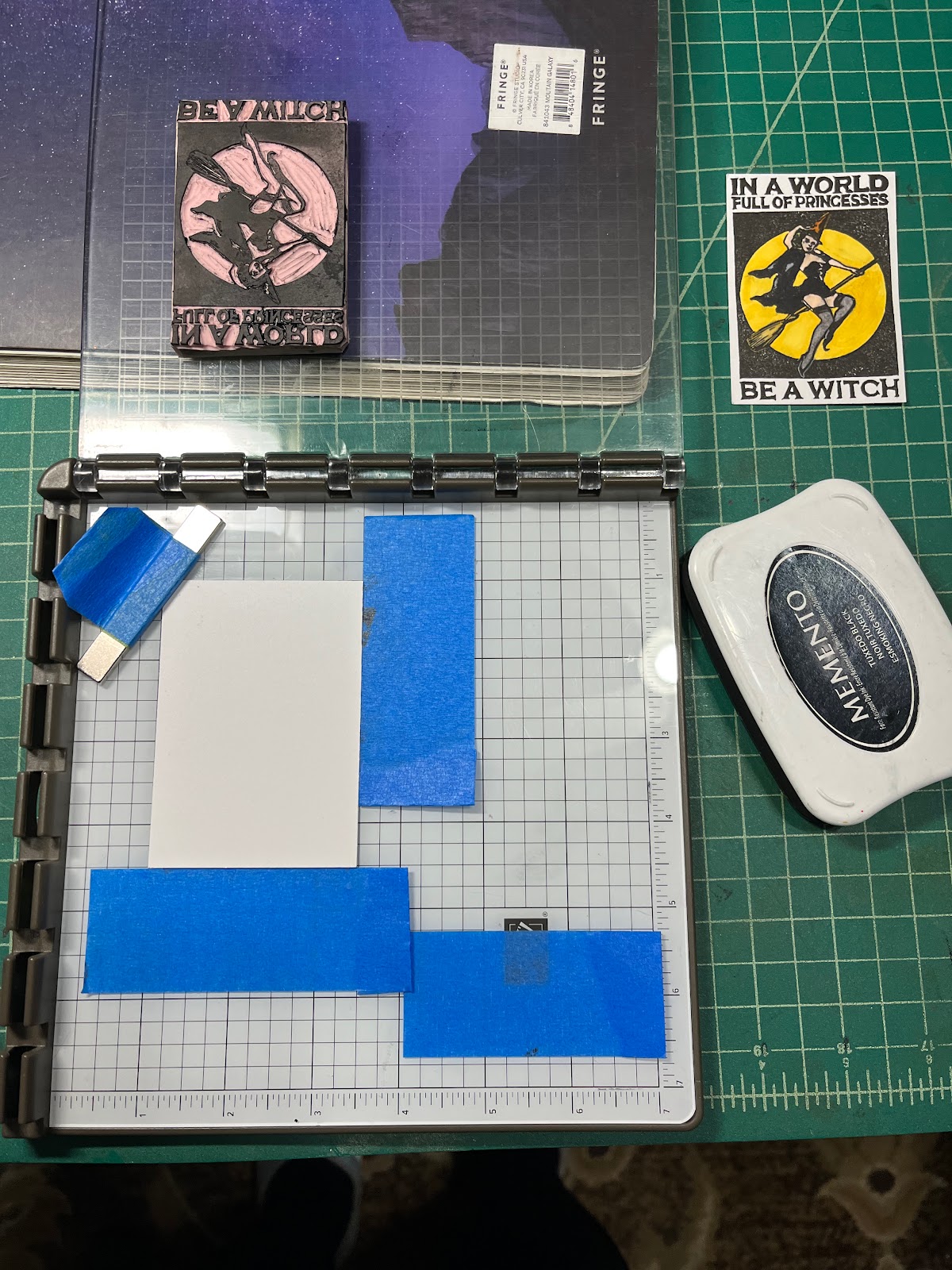
a good impression with a stamping platform.

  • Use painter's tape to align the card stock, and/or  magnets to hold the card in place.

  • Use Elmer's glue stick (or glue of choice) to hold the stamp in place on the hinged panel.

  • I prop up the hinged acrylic surface with a book (purple & black) or a towel so I can press the ink pad against the stamp without warping the acrylic plate or having to remove the stamp from the plate.

  • For more thoughts on using a stamping platform, review this AQ discussion thread.
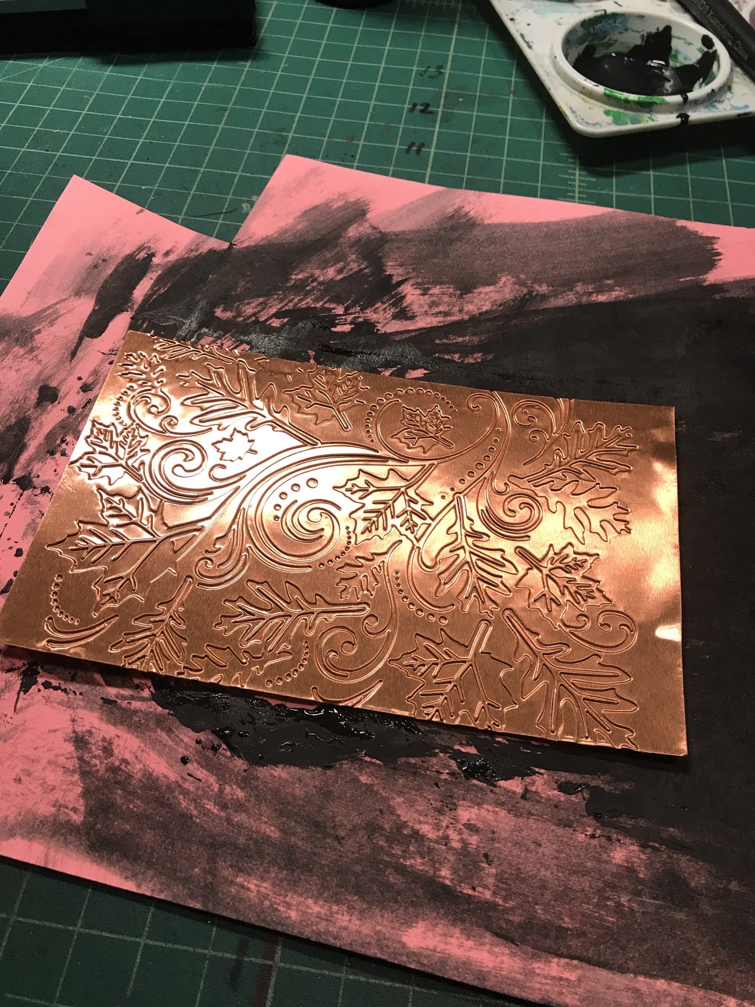
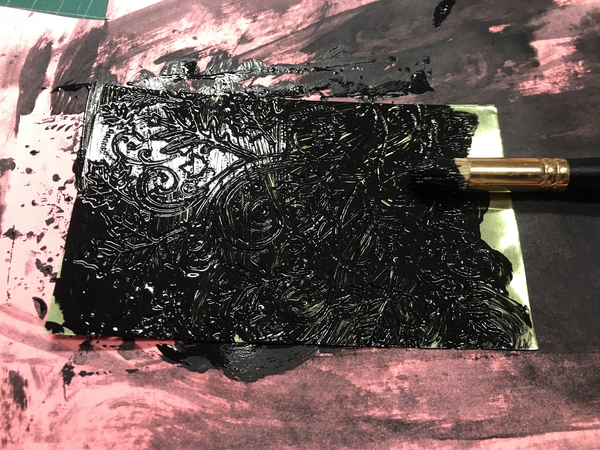


First stamping. 
The juicy ink pad paid off but notice how gritty and incomplete the image is. Re-ink the stamp and stamp again.
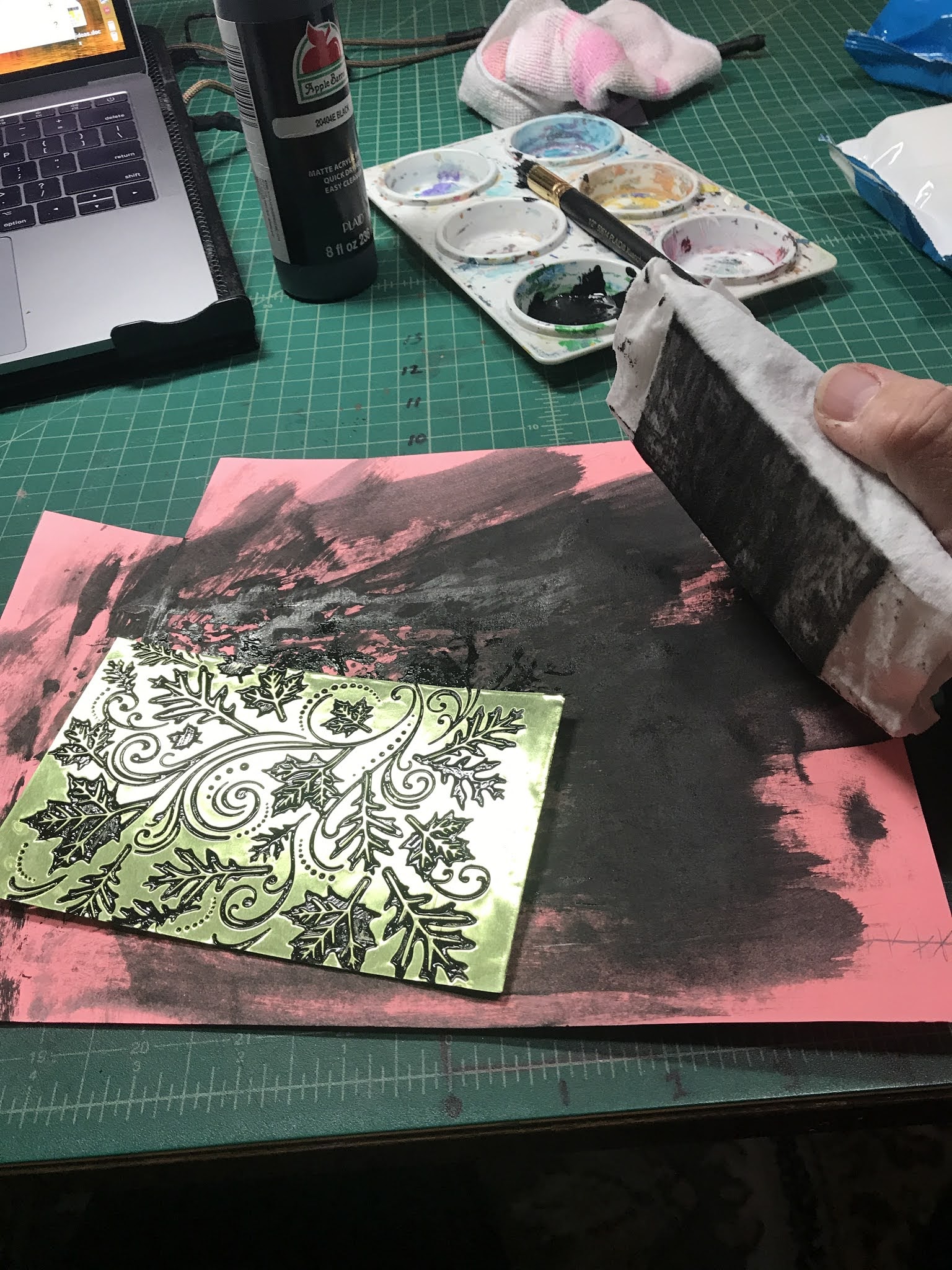


Second stamping.
Solid & bold! A higher quality stamped image for making cards for swapping. 


If a stamping platform is too expensive, consider what type of ink you are using and what surfaces you are stamping on. Little adjustments to our craft can make huge differences in the overall quality of our cards.

Share your strategies for making a good impression in the comments below.

Thursday, June 2, 2022

Nostalgia: Lil Red Wagon

 Nostalgia: Lil Red Wagon

Honestly, I never have an image in mind for a tracker before I list the tracker on AQ. The first place I begin searching for an image to carve is in a folder of images that I've collected over time while searching for  images for other trackers. This time the search for something  nostalgic-- art that recalls memories & meanings from the past in a way that might be painful.

As soon as I saw the wagon, I knew this was a winner.  I like this image because it shows the childhood we all left behind. I decided 

I wanted to highlight the wagon in red and that would be the only color I would use. So I had to rework the original image by layering an image of a wagon outline over the top of the original. I do this in Word by using the "squared" alignment.


I decided the final image would not include the lettering "Radio Flyer" on the wagon because I needed a more ideal carving situation-- lighting and magnification-- to manage the micro details of the logo. 

At this point, I was already contemplating how I would add that text later: printed cardstock, printed sticker paper, or something else.


Finding the right background for a negative (kids) & positive (wagon) combined carving was the most challenging step for this card.  I searched through all my papers and then searched through a fellow crafter's papers.  When she pulled out this paper, I knew it was perfect to build the nostalgia theme. All the words, to me, were reminders of lost innocence, and maybe reminders of what is important as I grow older. I opted to emboss the solid image. 

Embellishments were easy. Red brads for the axels and gloss on the red wagon which was colored with Copic marker. I also painted the wheel hubs with a white gel pen. 

Not having a printer available, another scrapbooking friend helped me by making the title tags with her Cricut. I was happy...

If I could redo/revise the card,  I'd change the title tag. I think it is too big and the color of the cardstock takes my eyes away from what I want my central focus to be-- the lil red wagon. I'm now picking at the title tag to see how easily it could be removed. LOLAM.

I'm happy with this card but the more I look at it, the more I'm torn about the matting color and the title tag. 

And now I have picked the title tag off of one. I like that there are more background words showing through. Might try the sticker paper now. 

Well, that didn't work. I feel like it needs something but what? 

And now I'm removing the lil titles from all the cards.  LOLAM. Calling it done... again. 

Let me know what questions you have. Thanks for reading. 

Susan


Wednesday, April 28, 2021

Framing Decisions


When I begin working with an image, I want to determine what size and what layout-- portrait or landscape-- to use. It can be challenging to determine when looking at just the image. 
A couple easy tools that can help with that. First, an LTC sleeve and second, a frame.


By simply laying the sleeve over the printed image, I can determine if the size and the layout are what I'm wanting.


The second method is my favorite-- the frame. Using black cardstock, I create a frame with a cutout the size of an LTC. The heavier the cardstock, the more durability the frame will have for future use. 

The black frame blocks out all the noise around the image, allowing our eyes to focus on just the image-- it's size and its position within the LTC parameters.   


Which layout & image position appeals to you? 


Some layouts offer more or less white space to explore additional media. Often, I pay attention to where my eyes want to go on the card and how my eye movement affects the interpretation of the content. As I explore adding additional media, I consider how each element affects the tone I want to convey or the mood the observer might experience. 


Hopefully, these ideas might help you 
Enjoy the process (more or less)!


Tuesday, November 24, 2020

Embossed, Painted Metal


For the Mixed Media: Metal tracker I hosted through AtlasQuest during September, I decided to work with thin sheets of aluminum to create a magical autumn background. 


 The metal (aluminum sheets) came in a variety of colors to work with. The labeling is long gone so hopefully if I ever want more of this, I'll find it. 


After selecting the background embossing folder for the autumn card, I set up the BigShot plates to emboss the sheets of metal. 


Important:
We will be working with the debossed side of the metal. The side in which the design is pressed into, so arrange the folder and metal appropriately. 

Another Important tip: embossing too deep on the metal will split or cut the metal sheets so adjust the embossing pressure carefully. 


The embossed cards are already eye-catching.  


Next, using an inexpensive acrylic paint


...and a stencil paintbrush,  I generously brushed paint into the debossed areas of the metal sheets. 


Do NOT let the paint dry. 


A couple trials proved that using a stiff, flat surface to wipe away the paint from the metal plates would work best. I wrapped a sanding block with cheap wet wipes. Paper towels, rags would probably work too as long as they are not pulling paint from the debossed areas. The dampness of the wipe helped remove any drying paint from the surface of the metal. 


I gently wiped away the surface acrylic, leaving the paint in the crevices created by the debossing. I placed used cardstock under the metal sheets so I could wipe the paint off the surface and away from the metal sheet. 


Once enough paint has been removed and maybe a spot or two touched up with additional paint and rewiped, the metal sheets were put in a safe spot (away from the cat) to dry. They dried quickly, so I was able to keep working forward on other parts of this project. A craft heat gun might also help the drying process.

Wha-la! Without the acrylic and with! 


For this LTC set, I carved a flying witch with her black cat.  The moon was created with Tim Holtz Distress Ink and cut with a punch. The witch was embossed on the moon and a black matte used to set off the debossed autumn areas. 


Saturday, November 21, 2020

Mixed Media Inspiration: Nature's Palette

Find inspiration from nature's palette
to inspire a color palette for an LTC. 
(anything within nature or affected by nature)

Easiest way to see just the colors is to squint as you look as the pict. 

Following Photos (4) by Amber Dunayer 
https://www.facebook.com/amber.morris.9275
Powder Valley Nature Center. November 20, 2020


Following Photos by aMAZEing adventure frog, Nov. 2020


Following photos by Brandon Birge (https://www.facebook.com/brandon.birge)


More photos will be coming soon!