Saturday, June 22, 2019

MEDIA BINGO

Push yourself to experiment with your letterbox (artist) trading cards.

Acceptable Plays include: row, column, diagonal (4 or 5 squares,) four corners

**Design/Layout**
*Cardstock is a free media to use.
*Make your best decision if your media fits within one of the categories.
*Recycling a previous carve is okay as long as a newly designed LTC is created.
*A finished card should be less than 1/4 inch thick. 
*Be sure that all card elements are secured, especially glitter or flocking.

Saturday, February 23, 2019

Partial Embossing & Masking


Image result for bigkick

Linden Leaf set-up four LTC trackers to encourage using a new product or an underused product already purchased. Participants chose anything from gelatos and gesso to stencils to oxide and distress inks and more. I chose to work with my embossing machine which is a BIGkick along with the embossing folders and die cuts. 


The finished card titled Teal Silhouette. It features partial embossing and masking. My favorite video tutorial for these procedures: https://www.youtube.com/watch?v=IPaUNDtudzk
with thefrugalcrafter Lindsay Weirich


I began by creating a window template to use with the selected embossing folder from a double layer of cereal box thick cardboard. (You can buy these window templates too.) I tested a few other cardstocks/boards and this worked the best. I cut pieces larger than 2.5x3.5 pieces.


Using a diecut (the metal oval) I cut each layer of the cardboard with the BIGkick then lined up the ovals and glued them together. Once glued, I centered the oval and cut to just larger than 2.5x3.5. Larger would have been better in hindsight as I could have reused my template for greeting cards.


Next, with the pre-cut white cardstock  in the folder, I strategically taped the stencil to the outside of the folder. Find a way that works for you as long as the cardstock and template line up. Then I ran it through the machine. I had to test the pressure to find the right amount and adjust the machine plates


Wha la! an embossed card with a window. Now, repeat about twenty times.


I'll admit I don't plan all this out as I go. There is a lot of trial and error (and some cursing.) I decided to color the silhouette teal, which got me thinking why didn't I just cut a teal oval from cardstock and place it over an embossed card. All that aside...

I wanted the inked area to have depth so I used a variety of blues. (I was inspired by the video lady's winter scene.) To protect the embossed area from the ink pad, I created a stencil to use as a mask. Well, I did what the lady in the video told me to do.

With the mask taped (I tried magnets too) in place on my work surface I aligned the embossed card beneath and distressed the oval with a stenciling brush. I used a cut wave pattern, just like the video lady. Brushing upward each time, and moving the wave edge down and sideways for another color. 


 .          .          
Once inked with the blued, I gently added black around the inside edge to create a shadowed frame. (Just like the video lady. )


To emphasize the raised embossed area, I decided to buff the surface with these marshmallow -shaped sponges. I found them at the craft store in Shipshewana-- The Stamp Shop-- when I was there for an LTC retreat. (Shamelessly plugging.) They are dense enough not to smush into the low areas of the embossing.


Always, always buff the edges of cards to frame them. Keeps the observers' eyes trained to the work. I use a black pigment ink pad.


With all the edges buffed, I stamped the woman's silhouette. And finally taped the embossed layer to the matte. One final touch was to outline the teal silhouette with a clear shimmer brush.


Now, I'm exploring more ideas for using my BIGkick machine with its folders and diecuts for the second  round of New /Underused products, and LTC swap.

Learn more about LTCs--Letterbox Trading Cards-- at AtlasQuest:  https://www.atlasquest.com/about/glossary/l/#ltc


Friday, September 21, 2018

Simple Technique 1: Edging Cards

My favorite simple technique is to color the edges of the cards including matted layers. This quick and easy technique frames the card and keeps the eyes from wondering off the card. 

I use a marker for a crisp edge and for a softer edge, I buff the cards edge gently on a pigment ink pad (dryer the better.) Take a look at the results. Pay attention to where your eyes want to focus on each card. 


Simple Techniques 2: Add Color

Another easy technique I like that makes an impact is adding some color. I enjoy working with chalk as it is more forgiving than markers and mistakes can be erased with a pencil eraser. It also quickly covers large areas and is easy to blend. I often use it for large areas rather than marker or paint. I like the smudgy look because it creates dimension and even movement in the image. Here is an example.

  • Chalk can easily be erased with a pencil eraser. 
  • I do not seal the chalk with a fixative or other product since I'm not using a lot of chalk nor layering. 
  • Extra balls can be made from cotton balls or I purchase white balls from the pom pom section at the craft store.


Here are a couple cards from my collection that the artist simply added color and the carving came to life!
by Sunia
by Linden Leah


Tuesday, January 16, 2018

Splattered


I wanted to create a background similar to the original artwork (left) by Canadian artist Jeremy Scott.

I decided to try splattering paint so the first steps would involve choosing the right cardstock and paint or alcohol ink. After playing with acrylic paint and Canson 140 paper, I explored alcohol ink with glossy cardstock (which was actually photo paper.)


Then, I tested Color Burst-- a concentrated watercolor powder (see pict.) With each test, I also had to determine whether the liquid color would move on the card to create the splatter effect and whether the medium would dry and not smear. I was pleasantly surprised that the Color Burst liquid (water + powder) dried and adhered without problems. Plus, I loved the brilliant color.


During first attempts, I strategically placed a drop of the watercolor on the card. I blew through a straw directly downward at the drop.


It was easier to work through half a straw.

ter a few trial and errors, I began mass producing cards. It was easier to work through half a straw.


The direction of the starburst could be controlled by angling the straw.


I was happy with the results. With the exception of that splotch in the middle of each starburst. Many of those faded when drying.


I added another step to the process as I wanted more random splotches. Using my recycling bin, I arranged cards and then whipped a paint brush, wet with the Color Burst, across the cards.


I have no idea why I changed my splattering method, but instead of placing a drop of paint on the card with a brush, I blew directly onto the brush. The intensity of the air burst  as the distance the brush is from the paper affected each outcome. In a sense I was now air-brushing. Notice the cool apron which is a good idea when splattering paint.


The top two purple splatters were done by blowing directly onto the brush as seen in the picture to the left. The DROP is the first method I used.


Final backgrounds. I like how each card has its own personality.


Now to add the stamped image.

Surprisingly, Versafine pigment ink dried on the prepped photo paper and without smearing. I pre-tested both StazOn and Versafine on messed up splattered cards.

I marked my oddly shaped carved stamp so I could easily line it up on the cards (left.)

Next, I stamped a plastic LTC sleeve with StazOn to help me determine stamp placement on each card. (StazOn adheres and dries on the sleeve.)


The LTC sleeve was placed over the card to determine the best direction of the background.


I'll either frame the card with another card stock layer or distress the edges to finish this piece up. I'm enjoying the outcome.

Thanks Jeremy Scott for the inspiration and beautiful artwork!

Thursday, August 17, 2017

Best Tulle Ever


I was so in awe of Wise Wanderer's Letterbox Trading Card-- Celestial Art: Moonlight Magic that I wanted to copy the technique. A picture does not do the card justice so I've included a ten second video that reveals the magic of this technique. (Posted with permission.)


Wise Wanderer explained that she used tulle to create the magical celestial sky, so I added that to my ''retail therapy" list. I found a variety of tulle colors at a Michaels store-- white, black, red, and others-- and chose black tulle with silver glitter.


One of the challenges of this card was reversing my thinking about the carving. I needed to carve away the positive space of the transfer so the dark sky would take on the starry effect created by the tulle. Typically I carve away the backgrounds leaving the main image.


Positive shapes occupy positive space. 
Negative space is the background area around the positive shapes.

In this black and white image of the three wisemen, the positive space is made up of the camels, the sand, and would also include the star. After the transfer, I had to carve away the black instead of the pink. A mind boggling experience.

Made me wish I had software to invert the image. After the fact, I did find online software that would do just that, such as: http://pinetools.com/invert-image-colors   Look at that. Doh!


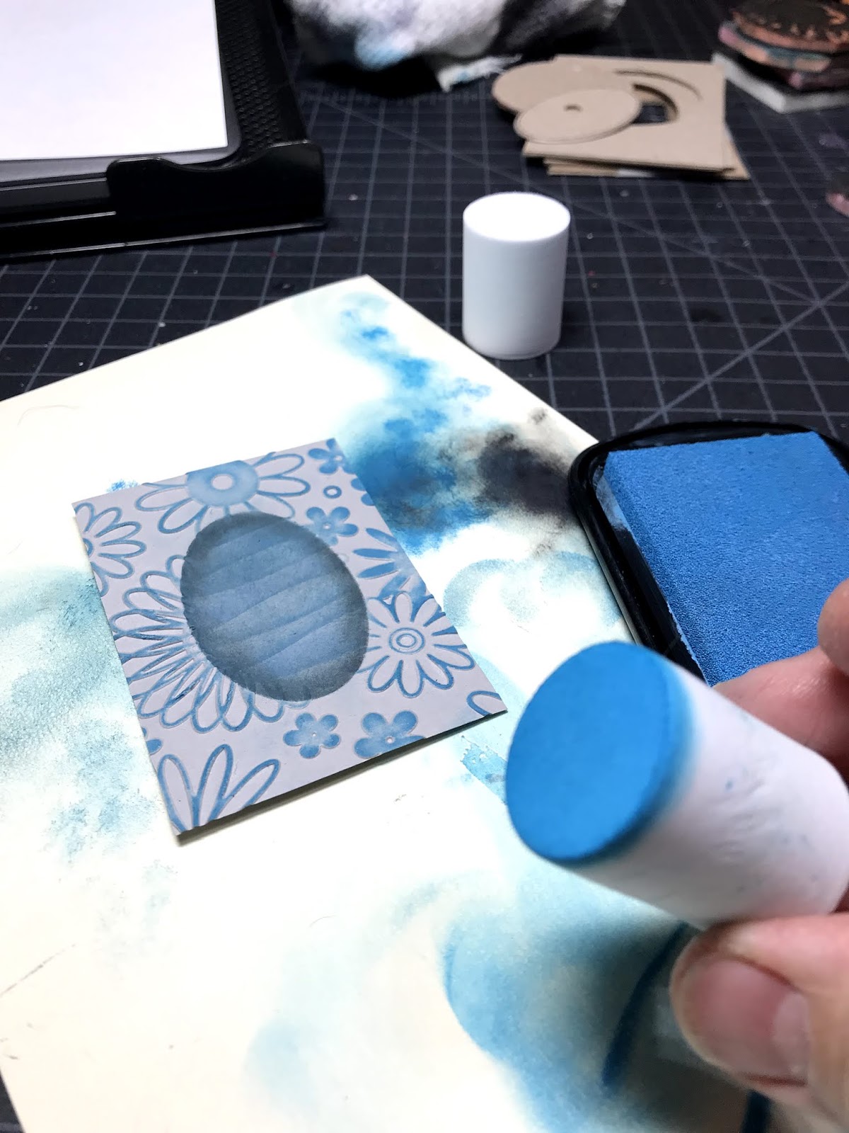
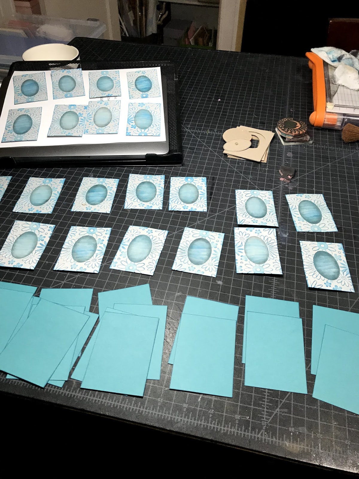
I pre-cut 3.5 x 4.5 rectangles of tulle. I thought layering the tulle on the card would be easy, but it turned out to be tricky and messy because I was using glue. Once I found out Wise Wanderer used (double-sided) adhesive tape, the process was so much easier. Double Doh!

My favorite tool for double-sided tape is the Scotch Advanced Tape Glider (ATG gun.) Took awhile to get use to wielding the pink gun, but once used to it, the savings are worth it.


Buying the tape refills in bulk makes it SO MUCH cheaper. A good source for bulk tape purchase is: https://www.tapejungle.com/


Running strips of adhesive along the back edges of the card, made it easier to pull the tulle tightly across the card, but not so tight as to curl the card.  I could readjust the tulle as necessary and cut off any extra material.


A sidenote: if there are glitter restrictions, avoid using this tulle as the glitter will come off.


I loved how Wise Wanderer's card is framed with the black card stock and wished I had done that too. Instead, I used a slightly smaller size card attached to the back to hide all the adhesive and extra tulle. I chose a cream card stock for a desert look; although, I think a tan would have been an interesting choice to explore too. In the finished card, the reason for carving the star is more clear.  This is my final card-- Guiding Star.


A big thank you to Wise Wanderer for sharing her LTCs, her craft, and
the tulles behind them.

Thursday, August 10, 2017

Testing inks on acrylic cards


While at the annual LTC retreat, I ran into stamping problems with my Color Field card (right). I created an acrylic base with a Gelli plate and then stamped the chimpanzee with my favorite black ink-- Versafine Pigment Ink. The ink would not dry completely and smeared. Also, the details were fuzzy. Eventually the problem was solved but not without frustration and accepting lower quality. Once home, I decided to test various stamp pads to determine which ink would be better for stamping on acrylics.


Using what I had available: 

  • Memento (dye),
  • StazOn (solvent), 
  • Versafine (pigment), and 
  • Speedball block printing ink (water soluble)
My goal was to determine which ink provided:

  • full coverage
  • details
  • pure color
I tested:
  • stamp and wait
  • heat set
  • Krylon matte finish
  • workable fixative
Once I applied the stamp, I waited a few minutes then rubbed a q-tip cotton swap across the stamped image. 

Results:
My results pointed toward heat setting Versafine

With more practice inking the stamp, I suspect that Speedball block printing ink might become a viable ink.

In Addition:
Typically I sand the surface of an acrylic surface to remove any ridges or bumps left by the tools used to apply the paint. Allows the stamp to make better contact with the surface for full coverage and details.

After this test, I wondered if a gel medium such as acrylic glazing or self-leveling clear gel by Golden would fill in grooves on the surface that the sanding did not eliminate thus providing an even smoother surface for the stamp.

Love to hear what is working for you as I enjoy working with acrylics and I'm always looking for improved processes and better (economical) products.